Passionate by nature, hard-working by choice. I help companies optimize their products and delight their audience by solving problems, developing solutions, and improving business and operational processes.
Solving problems and creating value is part of my core identity and what drives me - both in my personal life and my professional career. I enjoy serving in fields where I am most capable, such as UX design. I am enthusiastic about psychology and how it relates to people's interactions in the digital, marketing and entertainment environments.
In the span of more than 10 years since I first picked up digital design I have become an expert in the Adobe Creative Suite and expanded my skill set into all the facets of marketing with a high focus on UX Design and user research. However, my professional expertise expands into graphic design, inbound marketing, client management, and front-end development.
Over five years of experience working for an inbound marketing agency in Manchester, for a startup in Copenhagen, and as a freelancer have taught me a myriad of lessons about dynamic business environments. My colleagues and employers have described me as passionate, resourceful and incredibly hard-working.
Increasing users' level of satisfaction with a service by improving its functionality, usability and convenience to provide meaningful and relevant experiences.
Quickly building and continuously optimizing a peak-performing website that delivers user value, builds trust and drives business growth.
Attracting customers by forming connections your audience is looking for and delighting your users by solving problems they already have.
Helping a SaaS company provide value and deliver product solutions by understanding its clients and bridging the gap between the digital and the physical worlds.
Sport Compass is a remote-working company based in Copenhagen, Denmark, that promises to bridge the offline world of bars and the online world of sports fans.
The two problems that the service plans to address are complementary. First, sports fans need a manner in which they can find a bar in their area, that suits their interests, and that is broadcasting their desired match. Second, venue owners are struggling to attract customers due to their lack of technological know-how and modern marketing expertise.
Sport Compass aims to solve these problems through an all-in-one platform that facilitates event management for venues and event discovery for customers.
When I first joined Sport Compass, they had started building an online community through social media, as well as an initial version of the user side of their platform. The company initiated a collaboration with two bars, promoting their events on its website, but this was done manually by employees. They had a rough idea of the direction in which they wanted the company to progress, but nowhere near the actual products.
At this early stage, uncertainty dominates the business environment. Having to choose between too many diverging paths leads to aimlessness and hinders the progression of any company. Therefore, a crucial step of commencing work was defining what we knew we wanted the company to be, or at least, what we knew we didn't want it to be.
We concluded that, at the very least, we wanted to help our target groups by solving the two main problems we previously discussed. We didn't want to be just another fixture or social media platform, but one that combines these functionalities seamlessly and integrates well with the current workflow of our users and clients. We would achieve this by building our website with those two main goals in mind - helping users find a venue and helping owners gain more customers - while executing research to determine what other difficulties our audience is facing and how we can address them.
We also decided which set of tools we would be using internally to bring our idea to reality - Google Drive for documents and file sharing, Asana for project management, Slack for communication, Figma for design and prototyping, and Git for development.
Going from a mere idea to a functional tool is never easy, especially when you lack knowledge concerning the specific desires of your target groups. This was the variable we set out to clarify next, as we were developing our platform and driving the project forward.
Through our collaboration with the two bars, we were able to participate in a wide number of events and assess how the bar employees and users were interacting with our website. By regularly observing and interviewing our target groups, we were able to make incremental improvements to the customer-facing side of the platform, enhancing the overall user experience.
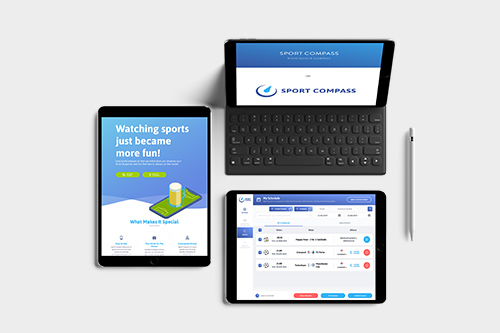
In the meantime, we used Figma to create an initial design of the bar panel. A complex tool like this makes it easy for inexperienced users to get lost unless it offers intuitive interactions and a clear separation between different sections.
The panel is split up into four parts: Setting (for various preferences), Dashboard (for an overview of your current and future events), Events (for searching, scheduling and publishing events) and Insights (for a way to view and analyze statistical data regarding your past events).
We chose to focus on the Events section, which includes the essential functions of the bar panel. We defined a user flow which included searching for matches, adding them to a schedule, creating a custom event, and publishing everything to the bar's website and social media. After designing the screens and elements required for this flow, we built an interactive prototype and organized meetings with our two collaborators, taking them through the process described.
Through observation, task analysis and surveys, we could gauge the bar owners' opinions of the prototype, and determine what changes the panel would require, to adequately serve their needs. Furthermore, we uncovered other aspects of their workflow, which we could integrate into the bar panel, making their jobs easier and improving their experience. For example, they usually manually fill in and print out an excel spreadsheet with the schedule for next week and channel instructions for the employees, a process which could be easily automated.
Equipped with a better awareness of our users' needs, we set out to reconstruct the prototype and integrate the improvements we established. However, we soon realized that the increasing complexity of our platform, combined with its ever-changing nature required us to be more mindful of the systems we put in place when designing the tool. Therefore, to solve this issue and ensure consistency, we dedicated time to creating a design system, rebuilding our prototype in Figma using components. I defined and documented the first brand guidelines. I also redesigned the logo to ensure it reflects our brand and the modern, forward-thinking nature of the company.
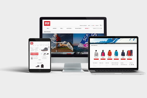
With design and development in full motion, we undertook another objective of our business - raising awareness about our upcoming platform. Most of our users were discovering Sport Compass through social media or by word-of-mouth because the website merely served scheduled matches. We designed and developed a landing page that still provides this functionality while also offering an introduction to the service, its unique selling propositions and the team behind it.
At the same time, we wanted to spread the word to pub owners and validate our idea by gathering letters of intent from several bars in the Copenhagen area. We decided this would be an ideal opportunity to gain a deeper understanding of our potential clients and their pain points.
We organized interviews with twelve venue managers, which revolved around a set of questions that ranged from defining their establishment and priorities to describing their current means and processes. The interviews were followed by a quick presentation of the new prototype, taking them through the process of searching for some games, organizing a custom event, adding everything to their schedule and publishing this schedule to Sport Compass and social media platforms. The meetings were wrapped up by asking the managers a simple question of whether or not they would use a tool like that.
The research uncovered several additional unexpected problems. The managers are spending a considerable amount of their working time using multiple outdated tools to gather game programs and build their schedule. The way they were struggling to collect various sports fixtures from different sources or even using hand-written agendas as their primary means of keeping track of reservations left us astonished as well as inspired with numerous ways that we could contribute.
All but one of the pubs we approached signed letters of intent, proving that the service is indeed on the right tracks.
With the beta version of the bar panel recently released, it might seem that the long journey is coming to an end. However, being aware of the additional functionality we intend to add to the panel and the ongoing surveys and testing that will undoubtedly reveal new information, we know this is just the beginning - there is still much work to be done.
Nevertheless, by setting the right systems in place and through comprehensive research, Sport Compass has evolved from a community with an idea into a promising company providing real value, being closer than ever to a fully-functioning service.
Starting a company can be daunting and providing real value can be difficult. But it doesn't have to be that way. Get in touch to find how I can help you turn your business idea into reality.
Helping a digital agency drive business growth and position itself as a top marketing authority by doing a website redesign focused on an enhanced user experience.
Luminate Digital is a digital growth agency that provides inbound marketing and growth-driven web design solutions for the professional services sector throughout the UK.
I joined the recently founded company as Design Executive in May 2017. They wanted to increase their client base, become a top HubSpot partner agency and an authority within the marketing field.
To ensure the best marketing practices, everyone on the team became Inbound certified through the HubSpot courses. I obtained this certification in the period leading up to my employment. In addition to this initial training, each member increased their expertise by completing courses relating to their specialization. I quickly obtained the Growth-Driven Design, Email Marketing, HubSpot Marketing Software and Client Management certifications.
Building on the knowledge obtained from our training, we had frequent initial meetings establishing company goals and defining target groups. We created a business model canvas that would act as a one page summary of the agency and ensure that everyone is on the same page about our focus.
We executed a competitor analysis by examining HubSpot partners that were already displaying the characteristics of our ideal agency, looking for methods that we could emulate or further develop. We then used these insights to set time-dependent company goals that we would track based on Key Performance Indicators such as website visits, landing page conversion rates, email open and click-through percentages and number of clients.
Throughout this initial setup, as well as further down the line, I designed custom templates for all internal and customer-facing documents - default document template, business model canvas, organizational chart, sales presentations, business cards, email templates and more.
Based on the agreed-upon business goals, I set out to revamp the company branding to reflect our new identity.
The central brand color - yellow - suited the company style, but the original hue #f1e91a
felt too artificial and unfriendly. I made a slight change to obtain a warmer and more welcoming hue #fce030
that also translated better in a printed format.
We added the line "Digital Marketing Agency" to the logo, that would instantly define our activity. After further study and deliberation, we subsequently changed it to a more approachable "Digital Growth Agency". For circumstances in which the extra line was unnecessary or when spacing was limited, I designed a compact version of the logo that was not as descriptive, but just as able to promote our brand.
Using knowledge gained from the courses, our buyer persona research, and insights from our competitor analysis, I redesigned the website to offer improved user flows and an overall more gratifying and productive user experience.
The new homepage featured a hero area with a dynamic mission statement that changed to display all the target groups that we helped (law firms, accountancy companies, professional services, etc.), alongside six icons depicting our areas of expertise. After scrolling down, a card describing our company in detail replaced the mission statement. The content of this card updated based on the icon that the user clicked. An area with testimonials from current satisfied clients follows and acts as social proof for visitors.
Working in close collaboration with the development and sales teams, I designed and the programmers built a growth calculator that allowed users to input their current business metrics and predict their potential increase in revenue. These projections were based on results previously obtained through inbound methods and acted as an additional incentive for users to get in touch. We strategically placed a call-to-action section after the growth calculator to give people that used it an immediate opportunity to contact our company.
The next section presented recent content offers and blog posts, on the assumption that visitors that reached this point on the page and did not get in touch required more education about the benefits of inbound marketing practices. The homepage concluded with an area briefly describing our team culture and expertise.
The global footer contained quick navigation links to the main website pages, our social media accounts, and a contact form with minimal requirements. We paired this with a testimonial and a prominent call-to-action to maximize conversion.
I designed the other pages using a similar thought process to enhance the value visitors would obtain from them, guiding them through the buyer journey and increasing the likelihood that they would become clients.
From the resources section or by clicking through marketing emails, users would reach landing pages revolving around a downloadable content offer. These landing pages lacked navigation links to other parts of the website and focused entirely on persuading the user to fill in the form to receive their document. We set up these forms using built-in HubSpot functionality to change the questions based on which contact that was filling them in and what information we had already learnt about them. Through this method, we gathered more data about our leads, faster than through traditional means, improving the prospect of a successful sales pitch.
Using InDesign, I created several eBook templates that I used whenever our agency or one of our clients published a new content offer. I designed several landing pages in Photoshop using different layouts, testing against KPIs and improving them with each iteration. Through this continuous improvement and by identifying a crucial business opportunity with the upcoming enforcement of the GDPR, we produced a landing page for a GDPR pack that achieved a 35% conversion rate. I crafted the designs for the eBook, checklist and infographic included in this pack.
Throughout my employment, I also produced designs for all our clients business needs, such as website & landing pages, email templates, printed and promotional materials.
We attracted more users by improving the website's SEO and offering relevant content tailored to each of the stages in the buyer's journey. Through thoughtfully positioned Calls-to-Action, and with the help of valuable content offers behind data capture forms, we effectively converted visitors into leads. Using a combination of carefully crafted marketing emails, additional reading materials and conversations with our specialists, we guided our users to the Decision part of their journey, where most of them would choose to become clients.
By implementing equivalent methodologies and principles for managed businesses, Luminate Digital succeeded in delighting its clients, ensuring more long-term, mutually beneficial collaborations. By the time I left the agency in August 2018, it had increased website visits tenfold, achieved Gold HubSpot partner status and established itself as a top marketing authority in the North-West.
Honest, dependable and incredibly hard-working. Along with his undeniable talent, Andrei has always been a team player, and always manages to bring the best out of other employees.
Selling your services to other businesses is a real challenge, but through thoughtful research and development, it can be a breeze. Get in touch to find how I can help your company attract and delight more clients.
Helping a property investment company set the stage for business growth through a website redesign focused on the inbound marketing methodology.
The Heaton Group is a company that develops luxury living spaces to live, rent and invest in, enabling investors and homeowners in the UK and abroad to find their perfect property in the North-West. They contacted Luminate Digital looking to improve their marketing efforts in order to attract more leads and grow their business. They were struggling to generate new visitors, and their website content was tailored towards investors, making it difficult to engage other target groups (buyers and renters).
A plan was devised to revamp their online presence and equip them with all the methods and tools they would need to ensure they fully understand their target groups and are offering them the best online experience.
This plan included several phases - going through user research, building buyer personas, executing competitor analysis, and overhauling their website to guarantee that it is both adequately serving the needs of the visitors, as well as effectively generating the right leads for the company.
Our agency reached out to several current Heaton Group customers and organized phone interviews to gain a better understanding of their challenges and customer service expectations. The interviews were analyzed and compiled into buyer persona documents that focused on the five rings of buying insight.
The documents presented a summary of each persona in an easily digestible format, followed by a deeper dive into their priority initiatives, success factors, perceived barriers, decision criteria, and the buyer's journey. These proved very useful for both us and our client, allowing us to smoothly transition to the following stage.
We ran a competitor analysis to determine the strengths and weaknesses of The Heaton Group and three of their competitors in relation to their online presence. To help identify the competitors, we used information and insights from the interviews conducted as part of the buyer persona study.
A range of free and paid tools was used to compare and measure key marketing metrics in order to address six digital marketing topics: website ranking, traffic, digital content, social media, keywords, and backlinks. By discovering these strengths and weaknesses, we gained a clear understanding of The Heaton Group's place within the property development digital marketplace, an understanding which played an integral role in the production of the new website and future marketing strategies.
The preliminary research combined with our inbound marketing expertise enabled us to design a website that offered guests a new and improved online experience. The homepage diverts visitors to different pages serving tailored content depending on their interests.
Each of the new pages is optimized for conversion, using various combinations of case studies, testimonials, step-by-step descriptions of procedures, >unique selling propositions, statistics, and enticing imagery.
Throughout the whole process, from wireframe to final page, we had periodic calls with our client, getting sign-off on prototypes that accurately depicted first the function, and then the look of their new site.
The redesign also included a brand guidelines document to ensure visual consistency, as well as a set of three email templates in the new style, essential for future marketing purposes.
The number of contacts generated organically over six months increased by 250% thanks to the new conversion paths created on the website.
As a result of our efforts and collaboration, The Heaton Group also gained a much better understanding of their customers, which we used to prepare their content marketing strategy. This increased their blog views by over 230%, while also improving website engagement. Best of all, business is thriving, with the percentage of leads generated by marketing rising to an all-time high of 78%.
In today's business world, it's not enough to just attract people to your website; you have to continue to help, support, and empower them well after they become a customer. Get in touch to find how you can deliver solutions and opportunities that have a positive impact on people and your business.
Helping an estate and financial planning company better understand how to run a successful marketing campaign and enabling them to drive conversion rates, through landing page, thank you page and email templates.
Forethought is a company that promises stress-free estate planning by understanding their customers' problems and offering solutions tailored to their needs. They approached Luminate Digital looking for ways to enhance their marketing efforts and drive more conversions. They required methods and assets to help them engage more users and capture their data.
The first step we took was to evaluate the company's circumstances to make sure that both parties understand the problems and therefore agree on the solutions to be implemented.
After examining their current practices and online presence, we were able to determine a couple of areas where there was room for improvement. Their website was in excellent shape, with consistent branding that consolidated their authority and copy that clearly described the services they offered. However, they needed to grow traffic and then capture the users' data in order to drive them further down the funnel.
We took them through the steps of a successful marketing campaign and suggested they increase their reach by implementing landing pages and running email campaigns. We delivered a set of a landing page, thank you page and email templates that were consistent with their current branding, but flexible enough to be used for different campaigns.
We produced three email templates, each with a different function. First, a general-purpose template, aimed at any sort of usual marketing communications. Second, a newsletter-type template, normally aimed at delivering users periodic blog post updates that they have subscribed to. The third one is highly focused on a single piece of content that deserves the reader's undivided attention. This last template is commonly used when launching a new content offer and it helps guide the users to a landing page where the company can find out more about them while delivering the promised file.
The landing page template offers a simple, yet effective layout for driving conversions. The top and middle sections feature ample copy space needed to describe the offer, as well as an image preview that clearly showcases the format - in this case, eBook. The form is placed above the fold, which allows communicating the main intent of the page to the user from the moment they visit, as well as bridging the gap between the top and middle sections. The bottom section takes advantage of the company's testimonials, which provide the social proof some visitors might require to submit their information.
The thank you pages that visitors are led to, after filling in a form on one of the landing pages, serve two purposes. First, they offer confirmation that the company has indeed received the user's data and will be sending their requested file to the email address provided. Secondly, they present an invitation to the user to follow the company on social media, thus further improving the client relationship.
Our guidance regarding marketing campaigns proved to be vital for the company and the templates developed were the ideal tools needed to execute them.
Forethought Estate Planning managed to attract more users to their web page, nurture their leads more effectively, while also using data capture to better understand their needs, thus facilitating and increasing the overall number of sales.
Your business can only reach its full potential when you effectively market your product and optimize your website. Get in touch to discover how you can build better conversion paths and generate new leads!
Devising a strategy to increase conversion rates and average order value for a Norwegian textile and sports gear producer through literature review, extensive research and user testing.
Helly Hansen is a Norwegian company that produces textiles and gear for sports and work on the ocean and in the mountains. During the first semester of my Digital Concept Development program, I formed a group with two of my classmates and one student from the University of Applied Sciences Hague. We engaged in an assignment that required us to drive conversion rates and increase average order value for Norway-based company Helly Hansen.
But how do you devise a strategy that achieves this goal without any access to internal data?
The first step we took in approaching the issue was understanding the Norwegian cultural environment through a review the Geert Hofstede Analysis, a six-dimensional model obtained from theory by professor Geert Hofstede.
Next, we ran a competitor analysis on Helly Hansen and six of its rivals, examining prices, shipping, product range, website functionalities and social media presence. Additionally, we investigated existing studies based on statistical data focused on Norwegian online shopping and social media usage.
This preliminary research helped us uncover potential areas of improvement, such as free shipping, delivery options, the integration of wishlists, and increasing social media engagement. It also highlighted the company's main unique selling point - Helly Hansen has custom-developed technologies and sells high-performance clothing.
For a better comprehension of the user behaviour, we created a survey and posted it to Helly Hansen's Norwegian social pages (Facebook, Youtube, Twitter). The responses from our target group helped us better understand the users' interactions with the company and their customer service expectations.
The survey showed a high percentage of visitors using mobile or tablet devices to access the website, meaning a redesign focused on responsiveness would have a substantial impact. Furthermore, it highlighted the importance of feature-rich products for our target group, something that Helly Hansen does not emphasize enough on their product pages.
Our research led us to the conclusion that Helly Hansen's best approach to increase AOV and conversion rates is by improving the online user experience.
The faster the user can proceed to checkout, the more likely they are to make a purchase. By serving them proven incentives (product features, calls-to-action), crucial information (shipping details, size guides), and shortening the three-page checkout process, Helly Hansen can streamline the buyer's journey and increase the likelihood of conversion.
We redesigned several sections of the current website (Featured, Homepage, Header and Product page) and tested them against the existing versions on Usability Hub.
The A/B testing was successful in confirming our predictions - The company needs to rethink its website from both an aesthetic and functional point of view. To maximize sales, they need to make sure they offer an impeccable online experience which aligns with their brand image.
Despite lacking a direct collaboration with the company, through literature review, extensive research and testing, our team was successful in devising a strategy that would undoubtedly positively impact Helly Hansen.
It is possible to boost conversion rates without drastically changing your website, by streamlining a few rough edges and smoothly guiding the shopper all the way to the end. Get in touch to discover how you can build better conversion paths and maximize sales!